
HTML & CSS in 45 Days: A Study Plan to Become a Middle Developers
08 August 2026
602 views
This study plan is up to date as of October 2026

The plan is drawn up by
Ethan Robinson,
Middle Frontend Developer

Reviewed by
Claire Whitman,
Accessibility & Markup Specialist
Share this free study plan:
In This Study Plan
Somewhere between "I can build a page" and "I can build a production-grade interface," most developers hit a wall that basic HTML and CSS knowledge doesn't prepare them for. Advanced Grid patterns, animation performance, scalable architecture, accessibility compliance, and cross-browser inconsistencies - these are the skills that separate a junior contributor from someone a team trusts with real production code. This 45-day plan is built specifically for that transition, and it assumes you already know the fundamentals: semantic HTML, the box model, Flexbox, and basic Grid.
I structured this plan around how much time developers at this stage actually have to study CSS seriously - most people asking how many hours should I study for CSS at the middle level are balancing a job search, freelance work, or a current role, not studying full-time. Each week is scoped for roughly 8-12 hours of focused work, spread across 6-7 days, which keeps the plan realistic without slowing down progress.
This is not a plan for reviewing what you already know. Every week introduces a specific professional skill: advanced Grid techniques, animations and transitions, custom properties and theming, BEM methodology, Sass, accessibility, and cross-browser compatibility testing. By day 45, you'll have moved from writing CSS that works to writing CSS that scales, performs, and holds up under real-world constraints - the actual bar for a middle-level frontend developer.
Who Is This Free Study Plan For?
This 45-day plan is built for developers who already have working knowledge of HTML, CSS, Flexbox, and basic Grid, and who now need to close the gap toward mid-level, production-ready skills. It assumes you can build a responsive layout without guidance and that you're comfortable reading documentation independently. The free plan is not designed to teach you to study HTML from scratch - that groundwork needs to already be in place. It works well alongside a job search, since several weeks map directly onto skills that appear in mid-level interview screens. The pacing also suits developers who want to learn CSS deeply enough to explain their decisions in a code review, not just produce a working result. Here is who benefits most from this specific plan:
- Junior developers preparing for a mid-level role. If you can build layouts but haven't worked with theming systems, animation performance, or accessibility requirements, this plan targets exactly those gaps in a structured order.
- Bootcamp graduates with a portfolio but limited production experience. Bootcamps rarely cover Sass architecture, BEM at
scale, or real cross-browser testing - this plan fills in the parts of the curriculum most programs skip due to time constraints. - Self-taught developers applying to their first or second frontend job. If interviewers have asked about CSS architecture, accessibility, or animation performance and you've felt underprepared, this plan directly addresses those recurring interview topics.
- Developers coming from a single framework (like Bootstrap) who need vanilla CSS depth. If you've relied heavily on a CSS framework, this plan rebuilds the underlying skills frameworks abstract away, which matters once you join a team with a custom design system.
- Working developers who want to formalize scattered knowledge. If you've picked up Sass, BEM, or accessibility practices piecemeal from different jobs or tutorials, this plan organizes that knowledge into a coherent, testable skill set.
Learn HTML & CSS Quickly with this Free Study Plan
If you want to study CSS at a mid-level pace, the most effective approach is to work through advanced topics in a deliberate order and apply each one immediately in a real layout. This free plan assumes you already study HTML comfortably enough to build semantic page structures without revisiting beginner syntax. Each week builds on the previous one, so skipping Grid, architecture, or accessibility exercises will make the later sections less useful. Follow the sequence, complete the projects, and use the weekly tips as checkpoints for whether the concepts are becoming practical skills.
If you prefer to learn by topic rather than follow a fixed 45-day schedule, our HTML roadmap and CSS roadmap offer a more flexible path, letting you move through individual skills at your own pace and revisit specific areas whenever you need them.
Week 1: Advanced CSS Grid
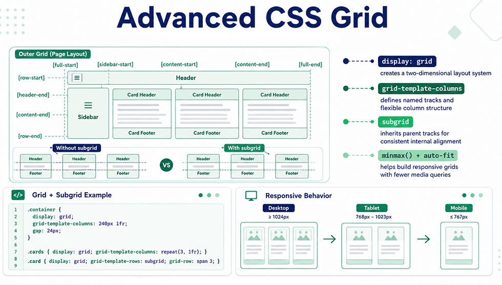
Week 1 pushes past the Grid basics most developers already know and into the patterns that appear in real production layouts: subgrid, named lines, implicit versus explicit grids, and complex responsive systems built without media queries. This is the week where Grid stops being "a way to make columns" and becomes a tool for genuinely complex layout logic. You'll also cover how Grid interacts with Flexbox in nested layouts, since production interfaces rarely use one layout system exclusively. By day 7, you should be able to structure a full application layout - including nested and asymmetric regions - using Grid alone.
| Day | Topic | Description |
| Day 1 | Implicit vs Explicit Grids | Study grid-auto-rows, grid-auto-columns, and grid-auto-flow, and how the browser generates implicit tracks when content exceeds a defined grid. This explains layout behavior that often looks unpredictable to intermediate developers. |
| Day 2 | Named Grid Lines & Advanced Placement | Learn to name grid lines explicitly and place items using line names instead of numeric indexes. This produces more readable, maintainable Grid code in larger codebases. |
| Day 3-4 | Subgrid | Cover grid-template-columns: subgrid and grid-template-rows: subgrid, and the specific alignment problems subgrid solves that nested independent grids cannot - particularly aligning content across sibling components. |
| Day 5 | Grid + Flexbox in Combination | Study when to nest Flexbox inside Grid items versus using Grid exclusively, based on whether the layout problem is one-dimensional or two-dimensional at each level. |
| Day 6 | Complex Responsive Grids Without Media Queries | Learn advanced minmax(), auto-fit, and auto-fill patterns for layouts that adapt fluidly, reducing reliance on fixed breakpoints for certain layout types. |
| Day 7 | Review & Layout Reconstruction | Rebuild a complex reference layout (dashboard or magazine-style page) from a static design using only Grid, without referencing previous notes. |
This Week's Projects:
- A magazine-style article layout. Build an asymmetric grid with a large featured image, offset text columns, and pull quotes. This project trains named grid lines and non-uniform track sizing.
- A dashboard interface with
subgrid. Build a dashboard where multiple card components align their internal headers and footers across a shared row usingsubgrid. This isolates the specific alignment problemsubgridwas designed to solve. - A photo mosaic gallery. Build an irregular grid where some images span two columns or two rows while others occupy a single cell. This practices explicit spanning combined with implicit grid behavior.
- A pricing table with Grid and Flexbox combined. Structure the overall table with Grid, then use Flexbox inside each pricing card for internal content alignment. This tests your judgment on when to switch layout systems.
- A responsive product catalog without breakpoints. Build a catalog grid that reflows purely through
auto-fitandminmax(), with no media queries at all. This project pressure-tests your understanding of fluid Grid patterns.
Tips for This Week:
- I recommend inspecting production websites' Grid implementations using DevTools' Grid overlay before writing your own. Seeing how real sites structure complex layouts clarifies patterns that documentation alone doesn't make obvious.
- I suggest deliberately breaking your
subgridimplementations by removing thesubgridkeyword, then comparing the misaligned result. That contrast makes the specific problemsubgridsolves concrete rather than abstract. - You should time yourself building one layout this week to get a real sense of how many hours you should study CSS Grid before it becomes fluent - for most developers at this stage, that's roughly 10-15 hours of hands-on practice, not passive reading.
- I advise resisting media queries as a default fallback this week, even when they'd be faster. The point of these exercises is building fluency with fluid Grid patterns specifically.
Week 2: CSS Animations & Transitions
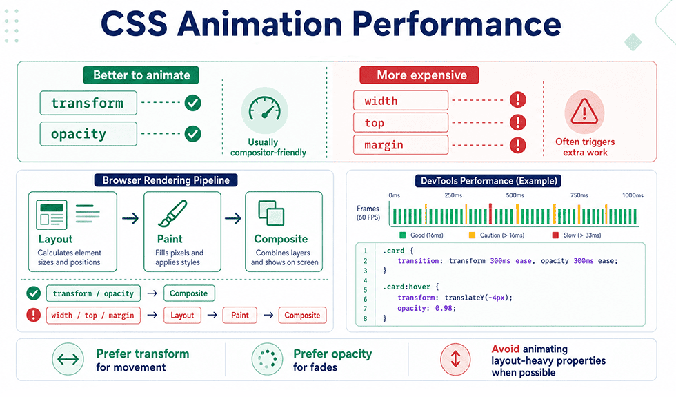
Week 2 covers motion - a category of CSS most intermediate developers use superficially without understanding performance implications. This week goes past basic transition and @keyframes syntax into animation performance, the difference between animating cheap versus expensive properties, and how the browser's compositor actually handles animated elements. You'll also study will-change, animation timing functions, and accessibility considerations around motion. By the end of the week, you should be able to explain why a specific animation is janky and fix it, not just make something move.
| Day | Topic | Description |
| Day 8 | Transitions in Depth | Study transition-property, transition-duration, transition-timing-function, and transition-delay individually, then combine them into shorthand. Cover common easing curves and their visual effect. |
| Day 9 | Keyframe Animations | Learn @keyframes syntax, animation-iteration-count, animation-direction, and animation-fill-mode. Understand how multi-step animations differ structurally from simple transitions. |
| Day 10 | Transform Deep Dive | Cover translate, scale, rotate, and skew individually and combined, plus the difference between 2D and 3D transforms using perspective and translateZ. |
| Day 11-12 | Animation Performance | Study which CSS properties trigger layout, paint, or composite-only changes, and why animating transform and opacity performs significantly better than animating width, top, or margin. Cover will-change and its trade-offs. |
| Day 13 | Motion & Accessibility | Learn prefers-reduced-motion and how to build animations that respect it. Understand why unmanaged motion is an accessibility concern for users with vestibular disorders. |
| Day 14 | Review & Performance Audit | Use browser DevTools' Performance panel to audit a previous animation project, identify jank, and refactor it using compositor-friendly properties. |
This Week's Projects:
- A micro-interaction button set. Build hover, focus, and active states with smooth transitions across five different buttons. This project trains timing function selection and
transitionproperty targeting. - A loading spinner and skeleton screen. Build a keyframe-based spinner and a skeleton loading state using
animation-iteration-count: infinite. This practices multi-step keyframe animation and fill-mode behavior. - An animated modal or drawer component. Build a modal that transitions in and out using
transformandopacityexclusively, avoiding layout-triggering properties. This directly reinforces the performance principles from Days 11-12. - A scroll-triggered reveal animation. Combine CSS transitions with the Intersection Observer API (JavaScript) to animate elements into view as the user scrolls. This bridges CSS animation with a common real-world JavaScript pairing.
- A
prefers-reduced-motion-aware animated hero section. Build a hero section with entrance animations that fall back to a static or minimal state when reduced motion is requested. This project makes the accessibility concept from Day 13 concrete.
Tips for This Week:
- I recommend running every animation project through DevTools' Performance panel at least once, even if it looks smooth. Jank is often invisible on fast development machines but obvious on lower-powered devices.
- I suggest defaulting to
transformandopacityfor any animation unless there's a specific reason to animate another property. This habit alone prevents the majority of animation performance issues developers run into later. - You should test
prefers-reduced-motionby actually enabling it in your OS settings, not just reading the media query syntax. Seeing your own animations disable correctly confirms the implementation works as intended. - I advise studying CSS animation timing functions visually, using a
cubic-beziertool, rather than memorizing keyword names likeease-in-out. Understanding the curve shape makes timing choices intentional instead of arbitrary.
Week 3: CSS Custom Properties & Theming
Week 3 covers CSS custom properties (CSS variables) as a system, not just a syntax shortcut. This is the foundation of scalable theming - dark mode, brand variation, design tokens - and it's a skill gap that shows up frequently in mid-level interviews. You'll study custom property scope, fallback values, and how to build a token-based design system that JavaScript can also read and modify. By day 21, you should be able to implement a working theme switcher without a CSS framework.
| Day | Topic | Description |
| Day 15 | Custom Property Syntax & Scope | Learn --variable-name declaration and var() usage, and how custom properties inherit through the cascade differently than standard CSS properties. |
| Day 16 | Fallback Values & Computed Values | Study the fallback syntax var(--name, fallback) and how custom properties can be computed dynamically using calc() in combination with variables. |
| Day 17-18 | Design Tokens & Theming Systems | Build a token structure for color, spacing, and typography scales using custom properties at the :root level. Understand how token systems reduce duplication across large codebases. |
| Day 19 | Dark Mode Implementation | Implement a dark/light theme switcher using custom properties combined with a data-theme attribute or prefers-color-scheme media query. |
| Day 20 | Custom Properties & JavaScript | Learn to read and update custom properties dynamically with element.style.setProperty(), connecting CSS theming to interactive JavaScript controls. |
| Day 21 | Review & Token System Build | Consolidate a complete design token system (colors, spacing, typography, radii) and apply it across a multi-page project for consistency. |
This Week's Projects:
- A full design token system. Define a complete set of custom properties for color, spacing, typography, and
border-radiusat the root level, then apply it consistently across an existing project. This is the core exercise for the week. - A dark/light theme toggle. Build a working theme switcher using
data-themeattributes and custom properties, with the preference saved and respected on reload. This project directly tests Days 19 and 20 together. - A themeable card component. Build a single card component that changes appearance completely (color, spacing, border) based on a
--themecustom property, without duplicating CSS rules. This trains component-level theming specifically. - A brand variation demo. Take one layout and produce three distinct visual "brands" by changing only custom property values at the root, with zero changes to component CSS. This proves the token system's actual scalability.
- A JavaScript-controlled spacing
scale. Build a small UI control (slider or buttons) that adjusts a--spacing-unitcustom property in real time using JavaScript, demonstrating the CSS-to-JS connection from Day 20.
Tips for This Week:
- I recommend naming your custom properties by purpose (
--color-primary,--spacing-md) rather than by value (--blue,--16px). Purpose-based naming survives redesigns; value-based naming doesn't. - I suggest building your token system before building any components this week, not alongside them. Retrofitting tokens into existing hardcoded values takes significantly longer than starting with the system in place.
- You should test your theme switcher with DevTools'
prefers-color-schemeemulation, not just a manual toggle button, since both trigger paths need to work independently. - I advise keeping your token naming consistent with what a design team would realistically use - this is one of the more transferable study CSS skills for actual team environments, where designers and developers often share the same token vocabulary.
Week 4: BEM & Scalable CSS Architecture
Week 4 addresses a problem that only appears at scale: CSS that works fine in a small project becomes unmanageable in a large one without a naming convention. BEM (Block, Element, Modifier) is the most widely adopted methodology for solving this, and it's a common topic in mid-level frontend interviews. This week also covers broader CSS architecture principles - specificity management, avoiding deep nesting, and organizing stylesheets for teams, not just individuals.
| Day | Topic | Description |
| Day 22 | BEM Fundamentals | Learn the Block, Element, Modifier naming structure (.block__element--modifier) and the specific specificity and maintainability problems it solves compared to nested or generic class names. |
| Day 23 | Applying BEM to Real Components | Refactor an existing component (built in earlier weeks) into BEM naming, and evaluate how readability and maintainability change as a result. |
| Day 24 | Specificity Management at Scale | Study strategies for keeping specificity flat and predictable across a large codebase, including avoiding ID selectors and minimizing nested selectors in production CSS. |
| Day 25-26 | File & Folder Architecture | Learn common CSS architecture patterns (ITCSS, 7-1 Sass pattern) for organizing stylesheets by layer - settings, tools, generic, elements, objects, components, and utilities. |
| Day 27 | Utility Classes vs Component Classes | Compare utility-first approaches against component-based BEM styling, and understand the trade-offs each makes around reusability and CSS file size. |
| Day 28 | Review & Full Refactor | Refactor a full multi-component project into BEM naming with an organized file structure, applying the architecture patterns from Days 25-26. |
This Week's Projects:
- A BEM-refactored component library. Take five components built in earlier weeks and rename every class using strict BEM conventions. This project is the most direct way to internalize the naming pattern.
- A card component with multiple modifiers. Build a single card block with three to four modifier variants (
--featured,--compact,--disabled) sharing the same base structure. This trains the modifier half of BEM specifically. - An ITCSS-organized stylesheet. Reorganize an existing project's CSS into layered files following the ITCSS pattern, from generic resets through to utility classes. This project makes the architecture concept concrete rather than theoretical.
- A specificity audit and fix. Take a CSS file with ID selectors and deeply nested rules, and refactor it to flat, low-specificity BEM classes with equivalent visual output. This directly practices Day 24's material.
- A component-vs-utility comparison page. Build the same UI section twice - once with BEM components, once with utility classes - and document the trade-offs in code volume and reusability you observe directly.
Tips for This Week:
- I recommend applying BEM to a real project immediately after learning it, rather than practicing on isolated examples. The naming convention only makes sense once you feel the maintainability problem it solves.
- I suggest not over-nesting BEM elements (avoiding
block__element__sub-element) - the convention is intentionally flat, and fighting that flatness usually signals the component should be split into two blocks. - You should study a well-known open-source project's CSS architecture this week to see BEM or ITCSS applied at real
scale, not just in tutorial-sized examples. - I advise treating this week's architecture principles as equally important to the syntax - interviewers assessing mid-level CSS skill tend to ask about organization and
scaleas often as they ask about specific properties.
Week 5: Sass & SCSS
Week 5 covers Sass, still one of the most widely used CSS preprocessors in production codebases despite the growth of native CSS custom properties. You'll learn variables, nesting, mixins, functions, and partials - features that let you write more maintainable CSS source code that compiles down to standard stylesheets. This week also addresses when Sass features overlap with native CSS and when each is the better choice.
| Day | Topic | Description |
| Day 29 | Sass Setup & Variables | Set up a Sass compilation workflow and learn Sass variables ($variable), covering how they differ from native CSS custom properties in scope and compile-time behavior. |
| Day 30 | Nesting & the Parent Selector | Study Sass nesting syntax and the & parent selector for writing BEM modifiers and pseudo-classes cleanly within a nested structure. |
| Day 31-32 | Mixins & Functions | Learn @mixin and @include for reusable style blocks with parameters, and @function for reusable value calculations. Cover common use cases like responsive breakpoint mixins. |
| Day 33 | Partials & the 7-1 Architecture | Learn Sass partials (_filename.scss) and @use/@forward for splitting a large stylesheet into organized, importable files following the 7-1 pattern introduced in Week 4. |
| Day 34 | Sass Maps & Loops | Study @each and @for loops combined with Sass maps for generating repetitive CSS (like utility classes or color scales) programmatically instead of by hand. |
| Day 35 | Review & Migration Exercise | Migrate a plain CSS project from Week 4 into a fully organized Sass architecture using partials, mixins, and variables. |
This Week's Projects:
- A Sass-based breakpoint mixin system. Build a set of reusable mixins for common breakpoints (
@include respond(tablet)) and apply them across a responsive layout. This is one of the most commonly reused Sass patterns in real projects. - A button mixin with parameters. Build a single
@mixinfor button styling that accepts color and size as parameters, then generate multiple button variants from it. This trains parameterized reuse specifically. - A color
scalegenerated with Sass maps and loops. Define a color palette as a Sass map, then use@eachto generate utility classes automatically. This project demonstrates Sass's advantage over plain CSS for repetitive generation. - A full 7-1 architecture migration. Take an existing multi-component project and restructure it into Sass partials following the 7-1 pattern, compiling to a single output file. This consolidates Days 33 and 35 into one deliverable.
- A responsive typography
scalefunction. Write a Sass@functionthat calculates font sizes across a definedscale, then apply it to headings throughout a project. This practices function syntax with a genuinely useful output.
Tips for This Week:
- I recommend not overusing nesting depth in Sass, even though it's tempting - deeply nested Sass often compiles into unnecessarily specific and hard-to-override CSS.
- I suggest building your mixin library incrementally, starting with the two or three patterns you repeat most (breakpoints, buttons, typography), rather than trying to anticipate every possible use case upfront.
- You should compare a Sass variable and a CSS custom property side by side in the same project to genuinely understand which use cases call for each - this distinction comes up often once you learn CSS architecture at a professional level.
- I advise setting up your Sass compilation workflow (via a build tool or CLI) early in the week so tooling issues don't interrupt the actual learning during Days 31-34.
Week 6: Accessibility (a11y)
Week 6 covers web accessibility as an applied skill, not a checklist. This is one of the most consistently underdeveloped areas among intermediate frontend developers, and it's increasingly a hard requirement in job postings and legal compliance standards (like WCAG and ADA-related requirements) in the US market. You'll study semantic structure's role in accessibility, ARIA attributes, keyboard navigation, color contrast, and screen reader testing.
| Day | Topic | Description |
| Day 36 | Semantic HTML as the Accessibility Foundation | Review how correct semantic markup from earlier weeks already solves a large portion of accessibility requirements before any ARIA is added. |
| Day 37 | ARIA Roles, States & Properties | Learn aria-label, aria-hidden, aria-expanded, and common roles, along with the first rule of ARIA: don't use ARIA if a native semantic element already provides the same behavior. |
| Day 38 | Keyboard Navigation & Focus Management | Study tabindex, visible focus states, and focus trapping for components like modals. Understand why keyboard-only navigation is a baseline requirement, not an edge case. |
| Day 39 | Color Contrast & Visual Accessibility | Learn WCAG contrast ratio requirements (AA and AAA) for text and interactive elements, and tools for testing contrast during design and development. |
| Day 40 | Accessible Forms | Cover proper label association, error messaging patterns, and aria-describedby for form validation feedback that works with assistive technology. |
| Day 41-42 | Screen Reader Testing & Audit | Test a previous project using a real screen reader (VoiceOver or NVDA) and an automated tool (axe or Lighthouse), then fix the issues found. |
This Week's Projects:
- An accessible modal component. Build a modal with proper focus trapping,
aria-hiddenon background content, and full keyboard operability (open, navigate, close with Escape). This is a frequently tested accessibility pattern in real interviews. - A fully keyboard-navigable menu. Build a dropdown or nav menu operable entirely without a mouse, with visible focus indicators at every step. This directly tests Day 38's material.
- An accessible form with validation. Build a form where every error message is announced to screen readers via
aria-describedbyandaria-invalid, not just displayed visually. This project makes the gap between visual and assistive-technology feedback concrete. - A contrast-audited component library. Run every component built in previous weeks through a contrast checker and fix any text or interactive element that fails WCAG AA. This is a practical audit, not new construction.
- A screen-reader-tested landing page. Navigate a full landing page using only a screen reader and document every point of confusion, then fix the underlying markup. This project builds the testing habit itself, which matters as much as any single fix.
Tips for This Week:
- I recommend testing with an actual screen reader this week, even though it feels uncomfortable at first. Reading about accessibility and experiencing it as a user produce very different levels of understanding.
- I suggest treating "don't use ARIA unnecessarily" as a real constraint, not a suggestion - overusing ARIA roles on
topof already-semantic elements frequently makes accessibility worse, not better. - You should run Lighthouse's accessibility audit on every project from this plan so far, since it often surfaces issues from earlier weeks that went unnoticed without a dedicated accessibility pass.
- I advise treating this week's skills as directly interview-relevant - accessibility questions appear consistently in mid-level frontend interviews, and hands-on project experience answers them far better than memorized definitions.
Week 7: Cross-Browser Compatibility
The final, shorter week addresses a practical reality: code that works perfectly in one browser can behave differently in another. This week covers browser support research, vendor prefixes, progressive enhancement, and the testing workflow professional teams use to catch compatibility issues before they reach production.
| Day | Topic | Description |
| Day 43 | Checking Browser Support | Learn to use Can I Use and MDN's compatibility tables to check feature support before relying on a CSS property in production, and understand baseline browser support targets. |
| Day 44 | Vendor Prefixes & Progressive Enhancement | Study when vendor prefixes are still necessary, how @supports enables feature detection in CSS, and the principle of building a functional baseline before layering on newer features. |
| Day 45 | Cross-Browser Testing & Final Review | Test a capstone project (combining Grid, animations, custom properties, BEM, Sass, and accessibility from all six weeks) across multiple browsers, fixing any inconsistencies found. |
This Week's Projects:
- A capstone project cross-browser audit. Test your most complete project from the plan across Chrome, Firefox, and Safari, documenting and fixing every visual inconsistency found. This is the culminating exercise for the full 45 days.
- A
@supports-based progressive enhancement component. Build a component that uses a newer CSS feature with a@supportsfallback for browsers that don't support it. This makes progressive enhancement concrete rather than theoretical. - A vendor-prefix audit. Review your Sass and CSS files from previous weeks for properties that may still need prefixing, based on your target browser support list.
Tips for This Week:
- I recommend checking Can I Use before adopting any newer CSS feature into a real project, not after something breaks in a client's browser.
- I suggest testing on an actual older browser version occasionally, not only the latest release, since real user bases rarely update immediately.
- You should treat this final week as validation, not new learning - if cross-browser issues surface constantly across your capstone project, that's a signal to revisit the underlying CSS rather than patch each inconsistency individually.
- I advise keeping a personal reference list of features you've had to work around due to browser support, since that list becomes genuinely useful across future projects.
Usefull Resources for Learning CSS
| Resource | Type | Best For |
| MDN Web Docs - CSS Reference | Free documentation | Authoritative reference for every property covered in this plan, including browser compatibility data used throughout Week 7. |
| How to Start Learning CSS with Courses, Apps, YouTube Channels & Games | Free article | A practical guide to different ways of learning CSS, including online courses, apps, YouTube channels, and interactive games for additional practice. |
| Sass Official Documentation | Free documentation | The canonical reference for Sass syntax, particularly useful during Weeks 5 for mixins, functions, and the module system. |
| Josh W. Comeau - CSS for JavaScript Developers | Paid course | In-depth coverage of animation performance, custom properties, and modern CSS patterns aimed at developers past the beginner stage. |
| Deque University / axe DevTools | Free tool + paid training | Automated and guided accessibility testing directly aligned with Week 6's audit projects. |
After 45 Days, You Should Be Able To
Forty-five days of structured, project-based practice at this level builds skills that map directly onto mid-level job requirements, not just broader familiarity with advanced CSS. This checklist is meant for honest self-assessment - if any item feels uncertain, that's a clear signal for which week to revisit before applying to mid-level roles. Use it to confirm readiness, not as a formality to skip past.
- Build complex, asymmetric layouts using advanced CSS Grid features, including
subgrid, without relying on Flexbox as a workaround. - Implement performant CSS animations using compositor-friendly properties, and diagnose animation jank using browser DevTools.
- Design and apply a token-based theming system with CSS custom properties, including a working dark/light mode toggle.
- Structure a CSS codebase using BEM naming and a layered architecture (like ITCSS), in a way another developer could navigate without guidance.
- Audit and fix a component for accessibility and cross-browser compatibility, using real assistive technology and browser support data rather than assumptions.
Reaching this point puts you solidly at a mid-level standard, but frontend development doesn't stop scaling in complexity once you hit that mark. Senior developers are expected to make architectural decisions, mentor other developers, and understand CSS performance and system design at a level this 45-day plan only begins to introduce. If you've completed every project in this plan and the checklist above feels solid rather than shaky, you're ready for that next jump. The senior-level path builds directly on everything covered here - Grid, Sass, accessibility, and architecture - and extends it into large-scale system thinking, advanced performance optimization, and leadership-adjacent skills that define senior-level work.
Your next step is HTML & CSS in 100 Days: A Study Plan for Senior Developers
You should read this Beyond the Basics: A 30-Day Git Free Study Plan for Middle Developers