
HTML & CSS in 30 Days: A Study Plan for Beginners
08 August 2026
627 views
This study plan is up to date as of October 2026

The plan is drawn up by
Ethan Robinson,
Middle Frontend Developer

Reviewed by
Claire Whitman,
Accessibility & Markup Specialist
Share this free study plan:
In This Study Plan
Every frontend developer's career starts in the same place: a blank HTML file and a stylesheet that refuses to cooperate. Learning HTML and CSS looks simple on the surface - tags, selectors, a few properties - but the gap between "I can build a page" and "I can build a page that actually holds up on any screen" is where most beginners stall out. This study plan closes that gap in 30 days, with a structure I built specifically for people who want to study HTML and CSS without wasting time on tutorials that never connect to real projects.
I designed this plan around a simple principle: you learn HTML and CSS easily when each day builds directly on the day before, not when you jump between random topics. The first two weeks cover semantic HTML and the box model - the foundation everything else depends on. Weeks three and four move into Flexbox, CSS Grid, and responsive design, so by day 30 you're not just reciting property names, you're building layouts that respond to real screen sizes.
This is not a theory-heavy course. Every week pairs new concepts with projects you build immediately, because retention in frontend development comes from typing code, breaking it, and fixing it - not from watching someone else do it.
If you follow this plan for 30 days to learn HTML and CSS, you'll finish with a small portfolio of responsive pages and a genuine understanding of how modern layouts work, not just a checklist of memorized tags.
Who Is This Free Study Plan For?
This 30-day free plan works best for people at the very start of their frontend journey, and I built the pacing specifically around that starting point. It assumes no prior coding background, though basic computer literacy - installing software, navigating folders, using a text editor - will make the first week smoother. The plan works whether you're studying full-time or squeezing in an hour after work, since each day's material is scoped to roughly 1.5-2.5 hours. Here is who gets the most value from this study plan:
- Complete beginners with zero coding experience. If you've never written a line of code, this plan starts exactly where you are - no assumed knowledge of programming logic, terminals, or developer tools beyond what's introduced day by day.
- Career changers moving into tech from an unrelated field. Whether you're coming from retail, healthcare, marketing, or anywhere else, the plan is built around transferable logic (structure, hierarchy, visual composition) rather than jargon that assumes a technical background.
- Self-taught learners who tried HTML/CSS before and lost momentum. If you've started and stopped a few times, the day-by-day structure with built-in projects gives you the accountability and forward motion that scattered tutorials usually lack.
- Bootcamp or college students who want a head start. If you're about to begin a formal program, working through this plan beforehand means you'll walk in already comfortable with the basics and able to focus on harder material sooner.
- Visual learners who want to see results fast. Because every week ends with hands-on projects, you get immediate visual feedback on what you've learned instead of waiting weeks to see anything real on screen.
- Anyone deciding whether frontend development is the right path. Thirty days is a low-risk, well-defined commitment - enough time to genuinely test whether you enjoy building interfaces before investing in a bootcamp or a full learning path.
By the end of this section, you should know whether this plan matches where you're starting from. If it does, the next section walks through exactly how to study HTML and CSS across four structured weeks.
How to Study HTML and CSS Easily? Use this Free Study Plan
The easiest way to study HTML and learn CSS is to follow a clear sequence instead of learning random topics as they appear. This free 30-day study plan divides the process into four focused weeks, with each stage introducing only the concepts you need before moving to the next. Follow the schedule in order, complete the weekly projects, and use the tips to reinforce what you learn through practice.
If a day-by-day study plan is not the right format for you, explore our HTML roadmap and CSS roadmap instead - they organize the same core skills by topic, without tying your progress to a fixed daily schedule.
Week 1: Semantic HTML & Document Structure
The first week is where you learn how to study HTML easily by focusing on one thing at a time: structure. You won't touch CSS yet. Every professional frontend developer reads a page's HTML before its styles, because a page's markup determines how screen readers interpret it, how search engines crawl it, and how maintainable it stays as it grows. This week covers the anatomy of an HTML document, semantic tags, text and list elements, links and images, and forms - the building blocks that appear in nearly every website you'll ever build. By day 7, you'll be able to read an unfamiliar HTML file and understand its structure without guessing.
| Day | Topic | Description |
| Day 1 | HTML Document Anatomy | Learn the <!DOCTYPE html> declaration, <html>, <head>, and <body> structure, meta tags, and how a browser parses a document from top to bottom. This is the skeleton every page shares. |
| Day 2 | Semantic HTML Elements | Study <header>, <nav>, <main>, <section>, <article>, <aside>, and <footer>. Understand why semantic tags matter for accessibility and SEO, not just for organizing code visually. |
| Day 3 | Text, Headings & Lists | Cover heading hierarchy (<h1>-<h6>), paragraphs, <strong> vs <em>, and ordered/unordered/description lists. Learn why heading order matters for accessibility, not just visual size. |
| Day 4 | Links, Images & Attributes | Learn <a> with relative vs absolute paths, <img> with alt text, and common attributes like id, class, and title. Understand why alt text is a requirement, not an option. |
| Day 5 | Forms & Input Elements | Study <form>, <input> types, <label>, <select>, <textarea>, and the <button> element. Forms are where most real-world sites collect user data, so this section gets full attention. |
| Days 6-7 | Tables & Structural Review | Learn <table>, <thead>, <tbody>, <tr>, <td> for tabular data, then spend day 7 rebuilding a page from days 1-5 from memory to reinforce structure without looking at references. |
This Week's Projects:
- A personal bio page. Build a single page using semantic tags (
<header>,<main>,<footer>) that introduces yourself. This project forces you to choose the correct semantic element for each section instead of defaulting to generic<div>tags. - A recipe page. Structure a recipe with an ordered list for steps, an unordered list for ingredients, and a heading hierarchy that reflects the content's importance. This tests your understanding of when to use ordered versus unordered lists.
- A simple blog post layout. Mark up a blog article with
<article>, proper heading levels, and embedded images with descriptive alt text. This project practices semantic structure alongside image accessibility. - A navigation menu. Build a
<nav>element with multiple<a>links pointing to different sections of a single page using anchor links (#section-id). This practices both semantic navigation and in-page linking. - A contact form. Create a form with name, email, message, and a dropdown for "reason for contact," using proper
<label>associations. This is the project most beginners underestimate, since correct label-to-input association is a common accessibility gap. - A "resume as HTML" project. Rebuild your resume using tables for any structured data (like a skills matrix) and semantic tags for the rest. This project combines everything from the week into one cohesive document.
Tips for This Week:
- I recommend typing every example yourself instead of copying and pasting. Muscle memory for tag names and attribute syntax builds faster through repetition than through reading.
- I suggest opening your HTML files directly in a browser after every change, even small ones. Seeing immediate results keeps you honest about what your code is actually doing, not what you assume it's doing.
- You should validate your HTML using the W3C Markup Validator at least once this week. Beginners often write code that "looks right" but contains structural errors a validator will catch immediately.
- I recommend keeping a short daily note of one thing that confused you. Reviewing that list at the end of the week usually reveals a pattern worth revisiting before you move to CSS.
Week 2: CSS Fundamentals & The Box Model
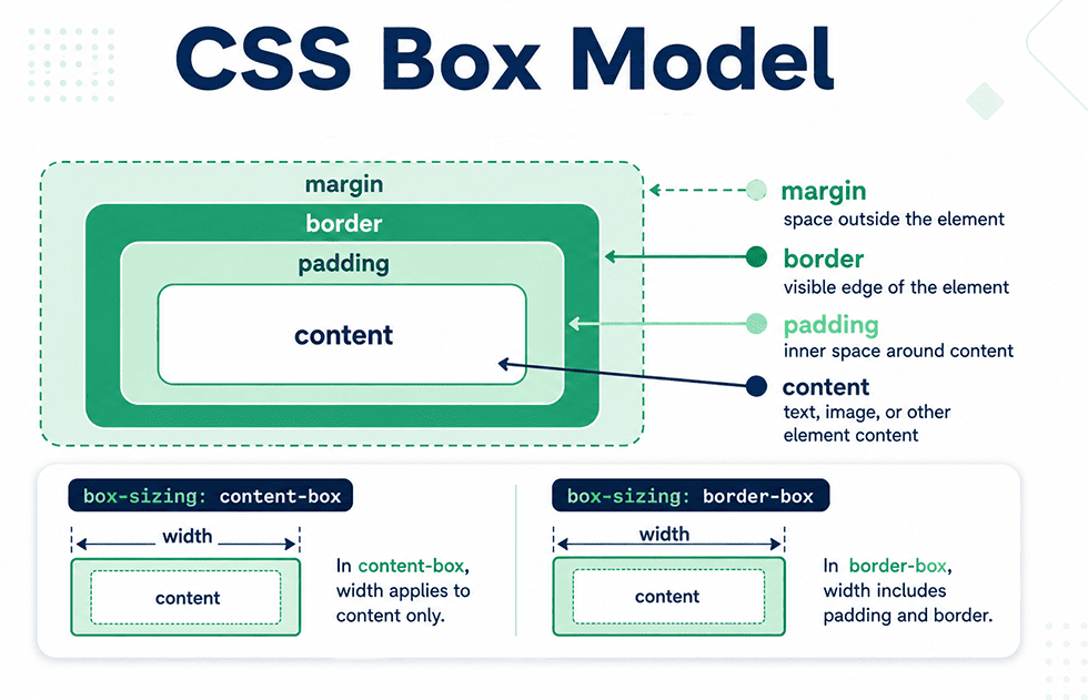
Week 2 is where your HTML and CSS in 30 days journey starts to feel real - your pages stop looking like plain text documents and begin to look like designed interfaces. The center of this week is the box model, considered the single most important concept in CSS because every element on a page, without exception, is a box governed by its rules. You'll also cover selectors, the cascade, specificity, colors, typography, and the display property. Misunderstanding the box model is the most common reason beginners fight with spacing and layout for weeks longer than necessary, so this week moves deliberately rather than quickly.
| Day | Topic | Description |
| Day 8 | Linking CSS & Selectors | Learn the three ways to add CSS (inline, internal, external) and why external stylesheets are considered best practice. Cover element, class, ID, and attribute selectors. |
| Day 9 | The Cascade & Specificity | Study how CSS resolves conflicting rules through specificity, source order, and the !important flag. This explains why "my CSS isn't working" is usually a specificity problem, not a syntax error. |
| Day 10 | The Box Model | Cover content, padding, border, and margin, plus the critical difference between box-sizing: content-box and box-sizing: border-box. This single property choice affects every layout decision going forward. |
| Day 11 | Colors, Units & Typography | Learn color formats (hex, rgb, hsl), relative vs absolute units (px, %, rem, em), and font properties including font-family, font-weight, and line-height. |
| Day 12 | Display & Positioning Basics | Study display: block, inline, inline-block, and none, along with position: static, relative, and absolute. These control how boxes behave relative to each other and the page. |
| Days 13-14 | Backgrounds, Borders & Review | Cover background-color, background-image, border-radius, and box-shadow, then spend day 14 restyling a Week 1 project from scratch to consolidate the box model and selectors. |
This Week's Projects:
- A styled bio page. Take your Week 1 bio page and apply typography, color, and spacing rules using the box model. This project practices translating a design idea into
padding,margin, andborderdecisions. - A pricing card component. Build three side-by-side cards with borders,
box-shadow,padding, and consistent spacing. This is a strong test ofbox-sizing: border-box, since inconsistent box-sizing breaks card alignment immediately. - A styled navigation bar. Style your Week 1 nav menu with
display: inline-blockor inline links, background color, and hover states. This practices display properties and introduces basic pseudo-classes. - A button style guide. Create four to five button variations (primary, secondary, disabled, outlined) using only box model properties and color. This trains precision with borders, padding, and background without relying on layout tools yet.
- A quote/testimonial block. Style a blockquote with a colored left border, background tint, and italic typography. This project focuses on typography hierarchy and using color intentionally rather than decoratively.
- A "before and after" comparison page. Take an unstyled Week 1 page and place it next to its Week 2 styled version. This project is less about new code and more about seeing your own progress in the box model concretely.
Tips for This Week:
- I recommend using your browser's DevTools to inspect the box model on every element you style. Seeing the actual
paddingandmarginvalues highlighted visually clears up confusion faster than reading about it. - I suggest setting
box-sizing: border-boxglobally on every project from now on, since it's the industry standard and prevents a specific category of sizing bugs that confuses most beginners. - You should resist the urge to use
!importantthis week, even when a style "won't apply." Nine times out of ten, the real issue is specificity, and learning to diagnose it now saves significant frustration later. - I advise practicing with rem units instead of px for font sizes as early as possible. It's a habit that's harder to build later, and it directly affects accessibility for users who adjust their browser's default font size.
- I recommend rebuilding at least one Week 1 project without referencing your notes. If you can style a page from memory, the box model has actually settled in, not just been read about.
Week 3: Flexbox & Component-Level Layout
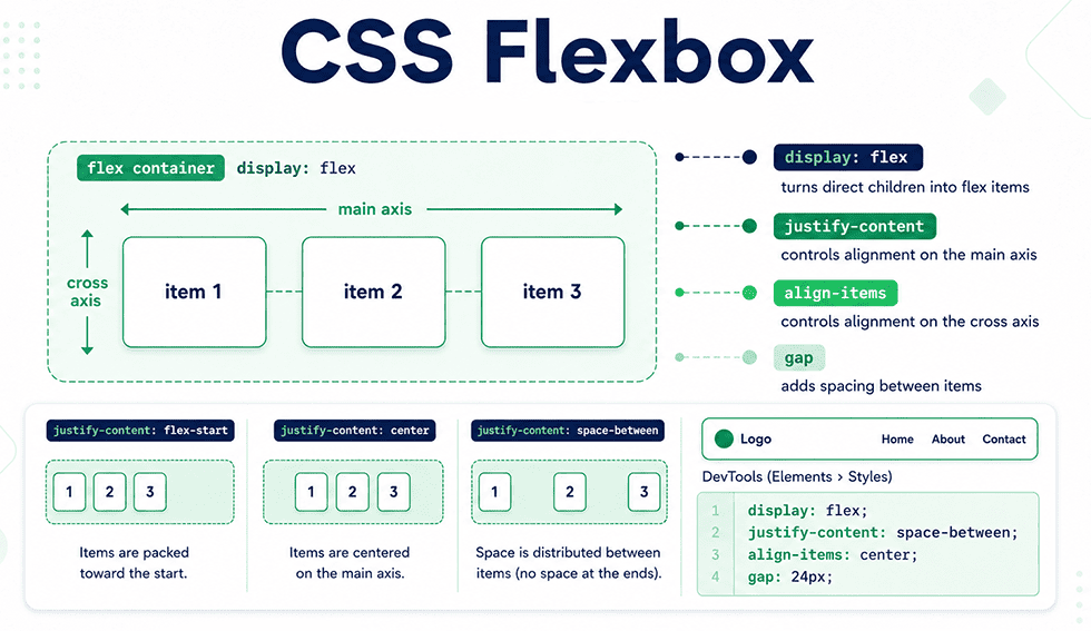
Week 3 is where layout stops being guesswork. Flexbox is considered the tool that solves the problems beginners hit hardest in weeks 1 and 2 - centering elements, distributing space evenly, and aligning items without relying on fragile positioning tricks. This week covers the flex container and flex item properties in depth, then applies them to real UI patterns: navigation bars, card layouts, and centered content. By the end of the week, "how do I center this" stops being a question you need to search for.
| Day | Topic | Description |
| Day 15 | Flex Container Basics | Learn display: flex, flex-direction, and how declaring a flex container immediately changes the behavior of its direct children. Understand the main axis versus the cross axis. |
| Day 16 | Justify & Align | Study justify-content and align-items in depth, covering every value (flex-start, center, space-between, space-around, space-evenly). This is the pair of properties beginners rely on most. |
| Day 17 | Flex Wrap & Flex Item Properties | Cover flex-wrap, then move into item-level properties: flex-grow, flex-shrink, and flex-basis. Understand how these three values interact to control how items resize. |
| Day 18 | Gap, Order & Align-Self | Learn the gap property for spacing without margin hacks, order for visually reordering elements without changing HTML, and align-self for overriding alignment on individual items. |
| Day 19 | Building a Flexbox Navigation Bar | Apply everything so far to a real navigation bar with a logo on one side and links on the other, using justify-content: space-between. This is the most common real-world Flexbox pattern. |
| Days 20-21 | Card Layouts & Review | Build a row of equal-height cards using Flexbox, then spend day 21 rebuilding two Week 2 projects using Flexbox instead of manual positioning to compare both approaches directly. |
This Week's Projects:
- A responsive navbar. Build a header with a logo and a set of nav links spaced using
justify-content: space-between. This project is the clearest real-world test of the main-axis alignment properties. - A card grid using Flexbox. Lay out four to six cards in a wrapping row using
flex-wrapandgap. This trains you to handle uneven content heights without cards breaking their alignment. - A centered login form. Center a form both vertically and horizontally on the page using Flexbox on the body or a wrapper element. This is the exact problem that used to require positioning workarounds before Flexbox.
- A pricing table with a "featured" plan. Use
align-selforflex-growto make one card taller or wider than its siblings. This practices item-level overrides within a shared flex container. - An image gallery strip. Lay out a horizontally scrolling or wrapping row of images using Flexbox with consistent
gapspacing. This tests wrap behavior with fixed-size items rather than flexible ones.
Tips for This Week:
- I recommend using the browser DevTools Flexbox inspector every time you build a new layout. It visually overlays the main axis and cross axis, which removes most of the guesswork around
justify-contentandalign-items. - I suggest practicing with
flex-direction: columnas much as row, since beginners often default to rows and get caught off guard when the axis logic flips for columns. - You should build the same layout twice - once with Flexbox and once with older techniques like floats or
inline-block- just to feel the difference directly. This comparison makes the value of Flexbox concrete rather than theoretical. - I advise learning
gapbefore you reach formarginon flex items. It solves spacing more predictably and avoids the uneven-edge problem that margin-based spacing often creates.
Week 4: CSS Grid & Responsive Design
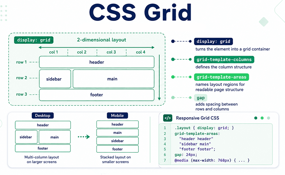
The final week ties everything together. CSS Grid handles two-dimensional layout - rows and columns simultaneously - which makes it the right tool for full-page structure, while Flexbox from Week 3 remains the right tool for one-dimensional component layout. This week also covers media queries and responsive design principles, since a layout that only works at one screen width isn't considered production-ready by any real standard. By day 30, you'll combine Grid, Flexbox, and media queries into layouts that hold up across phones, tablets, and desktops.
| Day | Topic | Description |
| Day 22 | Grid Container Basics | Learn display: grid, grid-template-columns, and grid-template-rows. Understand the fr unit and how it differs from percentages when dividing available space. |
| Day 23 | Grid Gap & Placement | Study gap in a grid context, then grid-column and grid-row for placing items across multiple tracks. Learn how to make an item span more than one column or row. |
| Day 24 | Grid Template Areas | Cover grid-template-areas for naming layout regions (header, sidebar, main, footer) in plain language. This is considered the most readable way to build full-page layouts. |
| Day 25 | Media Queries & Breakpoints | Learn @media syntax, common breakpoint ranges, and the mobile-first approach versus desktop-first. Understand why mobile-first is the industry-standard default. |
| Day 26 | Responsive Images & Units | Study max-width: 100% for images, vw/vh units, and the auto-fit/auto-fill grid keywords for layouts that adapt without explicit breakpoints. |
| Days 27-30 | Full Responsive Layout Build & Review | Combine Grid, Flexbox, and media queries into one multi-section page (header, hero, grid of content, footer). Days 29-30 are for testing the layout at multiple screen widths and fixing breakpoints. |
This Week's Projects
- A responsive page layout with Grid. Build a full page using
grid-template-areasfor header, sidebar, main content, and footer. This is the clearest demonstration of Grid's advantage over Flexbox for full-page structure. - A photo gallery using
auto-fit. Build a gallery grid that automatically adjusts its column count based on available width, with no media queries required. This tests your understanding ofminmax()andauto-fit. - A responsive pricing section. Combine Week 3's Flexbox cards with a Grid wrapper, then add a media query that stacks the cards vertically below
600px. This project practices combining both layout systems in one component. - A mobile-first blog layout. Design the layout for mobile first, then add media queries that introduce a sidebar and multi-column article grid at larger widths. This reinforces the mobile-first workflow directly.
- A dashboard-style layout. Build a layout with a fixed sidebar and a main content area using Grid, then make the sidebar collapse or hide on smaller screens using a media query. This is a common real-world pattern in admin interfaces.
- A capstone landing page. Combine everything from all four weeks - semantic HTML, box model styling, Flexbox components, and a Grid-based page structure - into one fully responsive landing page. This project is your portfolio piece for the month.
Tips for This Week:
- I recommend building every layout mobile-first, even if the final design is primarily viewed on desktop. Adding complexity as the screen grows is more predictable than removing it.
- I suggest resizing your browser window manually while building, rather than only checking DevTools device presets. Real content often breaks at widths that presets don't cover.
- You should decide between Grid and Flexbox based on dimensionality, not personal preference: two-dimensional layout problems belong to Grid, one-dimensional ones belong to Flexbox.
- I advise testing your capstone project on an actual mobile device, not just a simulated viewport. Touch targets, font rendering, and scroll behavior sometimes differ from what DevTools shows.
- I recommend documenting your breakpoint choices with a short comment in your CSS. Six months from now, remembering why you chose
768pxover600pxsaves real debugging time.
Best Resources to Study HTML and CSS for Beginners
| Resource | Type | Best For |
| How to Start Learning HTML: Beginner Guide for 2026 | Free article | Discover the benefits of study HTML, where to begin, and whether learning HTML is hard for beginners. |
| Master HTML Faster: Web Programming Guide | Free article | A beginner-friendly guide to learning HTML structure, semantic elements, practical projects, common mistakes, and the next steps after mastering the fundamentals. |
| MDN Web Docs | Free documentation | The definitive reference for every HTML tag and CSS property, with browser compatibility notes for each. |
| freeCodeCamp - Responsive Web Design Certification | Free interactive course | Structured, project-based practice covering everything in this plan, with built-in exercises and a certificate. |
| CSS-Tricks - A Complete Guide to Flexbox / Grid | Free reference articles | Visual, diagram-heavy explanations of Flexbox and Grid properties, useful as a companion during Weeks 3-4. |
| Kevin Powell (YouTube channel) | Free video series | Deep, practical CSS explanations from a working developer, particularly strong on the box model and Grid. |
| Frontend Mentor | Free/paid practice platform | Real design files to code from scratch, useful starting in Week 2 once basic styling is comfortable. |
| W3C Markup Validation Service | Free validator tool | Checks HTML for structural errors - worth running after every project in Weeks 1 and 2. |
What Can You Learn After Studying HTML and CSS for 30 Days?
Thirty days of consistent, project-based practice builds a specific and testable set of skills, not a vague sense of familiarity with HTML and CSS. This checklist exists so you can verify your own progress honestly, rather than assuming competence based on how many days you completed. If any item here feels shaky, that's a signal to revisit the relevant week before moving on to JavaScript. Competence at this stage means you can build without constantly searching for basic syntax, not that you have every property memorized. Use this list as a genuine self-assessment, not a formality.
- Write semantic HTML for a full page from scratch, choosing the correct element (
<header>,<nav>,<main>,<section>,<article>) for each section without guessing. - Explain the box model confidently, including the difference between
content-boxandborder-box, and predict howpaddingandmarginwill affect an element's rendered size. - Debug a CSS specificity conflict by reasoning through selector weight and source order, instead of reaching for
!important. - Build a component layout - a navbar, card row, or centered form - using Flexbox without referencing documentation for the core properties.
- Structure a full-page layout using CSS Grid, including named grid areas, and explain when Grid is the better choice over Flexbox.
- Write a mobile-first responsive layout with at least two breakpoints, and test it across multiple screen widths without the layout breaking.
- Read an unfamiliar developer's HTML and CSS and understand the structural and styling decisions being made, a skill that matters as much for job interviews as for personal projects.
Finishing this 30-day plan means you can build responsive, semantic layouts confidently - a genuine milestone, and one many self-taught developers never fully reach. But the skills that separate a beginner's portfolio from a hireable mid-level skill set live one level up: advanced Grid, animation performance, scalable CSS architecture, Sass, and accessibility, none of which this beginner plan covers. If the checklist above felt straightforward rather than uncertain, that's the clearest sign you're ready to move forward rather than repeat these fundamentals. The next stage takes everything built here and turns it into production-grade, team-ready skill.
Learn this HTML & CSS in 45 Days: A Study Plan to Become a Middle Developers
We recommend Git in 21 Days: A Free Study Plan for Beginners